 |
| Bad_Koala's Cave |
Bad Koala's blog is a very simplistic design, sticking to a gray scale template with white text, this makes the text easily visible and easy on the eyes to read. He uses his blog purely as a portfolio for his work and its development and so there is not much as far as discussion or explanation goes, he tends to post a small comment to briefly give an idea of what the image was created for. he also posts his images in a large format , this makes the images easily viewable from the home page of the blog and this means that viewers don't have the need to enlarge the image to get a good detailed look at it.
This blog is a good example of a professionals portfolio and is still tailored to the individuals style of work.
 |
| Perpetual Motion |
Ben's blog is a very stylistic blog that looks very futuristic and mechanical, this is a feature also present in his works posted on the blog and seems to be the key theme he works on. he has utilised a very simplistic colour scheme of whit with light gray text , although this goes will with the visual style of the blog it could be an issue with readers who are hard of sight as the gray text could be hard to see on the light background. the text posted on this blog is a lot more personal to the creator, explaining his feeling of when he created the imagery and what he remembers from the time of creation and also a small explanation of the image and what it is depicting.
 |
| Phlegm |
This blog is used as a showcase for phlegm's personal works, of all different kinds, and as an updating tool for his followers to stay up to date with the work he is producing and the comic that he sells.
this blog is again of a very simplistic design, he utilities a plain white background with contrasting black text , which again makes the text on the blog easily visible and readable. he has created a logo for his artist name and has placed it as the header for his blog , this allows his followers to recognize him , from his comics etc., and if now a sort of logo for his work.
phlegm tends to leave a good detailed description of how he has achieved the results of his work and gives exact details of the materials, media, techniques and tools used to create his work, this is a very useful way to explain the image as it allows people wishing to follow his style to know exactly what he is doing and how he is doing it.
 |
| Plant Monster Art |
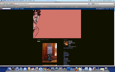
His blog is rather multicoloured in theme but this reflects the use of colour in his work and rather suits his style , also this doesn't affect the visual impact of the blog or the reader as the text is still clear and easily legible. he posts images of his personal work in large format but not with much explanation explanation or annotation, instead he may put a sentence stating what the image was used for (exhibition , product etc.). he has also utilised an image header liek phlegm but his is simply an image of one of his works. this image is does show the viewer what to expect from this blog but it takes up a large portion of the top of the page, this can take up the whole screen on smaller monitors and seems too big for its purpose.
This blog is extremely visually interesting and apart from the use of the image header is a well layed out and styled blog.
 |
| Sketchbook of Dshong |
Davids blog is again a very simplistic blog that uses a grayscale theme (darker for the background and lighter for the text), this makes the text stand out and easy to read. He posts mainly landscape scenes of a futuristic / alternative world, these are posted in a medium size format and which can make the detail of the images hard to see ( this is especially disappointing when they are such vivid and interesting imagery), but these images can be enlarged when clicked. there is no annotation to these images and with most of them there is no title, this means there is no text to describe the uses, feelings or artists techniques used to create the images and that makes this blog more of an image reel. one thing that i did find good about this blog was the header image as it incorporates the work of the artist , with the title of the blog and it is not too large like the previous blog so the reader can still see the start of the blog no matter what the screen size.
No comments:
Post a Comment