16/11/2010

Magazine Article Review

Article Title - Rising Stars
Featured Magazine - ImagineFX
Artist - Luke Manacini
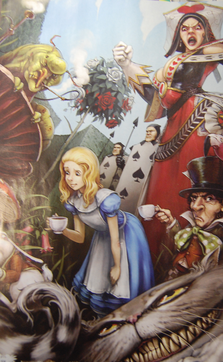
Alice - won a challenge onCGhub.com

Luke Manacini is a young American artist, working for blizzard gaming company ( creating games like world of warcraft, Starcraft and Diablo) as a concept artist on the Starcraft 2 project. Luke specializes in fantasy art and excels in his area due to his obsession with the blizzard games. he was hired to the blizzard team after applying his work in for the fan art section of the blizzard community and because of his versatility and ability to adapt his skills to produce different and interesting imagery.

Before joining the blizzard team Luke obtained illustrating jobs through his parents, including work form publishers McGraw Hill and Oxford University Press. He also worked for Privateer Press games studio and he quotes " working for Privateer was invaluable for pushing myself to develop a professional style - something i wouldnt have accomplished so soon by producing personal work".

Rustborne Aquilae - inspired by the work of Frazetta and Brom
Lukes love for his work inspires him to create more imaginative and creative imagery and he constantly strives to gain more artistic and stylistic knowledge to enhance his work.
"if you soak up as much art as you can, you can see what works and what doesn't"
he seeks inspiration from all areas and applies these to his work to find the best composition ,pose and style for the imagery he is producing at the time and this thorough research of all different art style is what makes him so flexible and adaptable to work in different styles.
 ______________________________________________________
Here are the processes that Luke works through when producing high quality imagery ;

1 - he creates thumbnails for the imagery to help figure out the pose and composition of the piece.

2 - he lays down the first colours (in a dark colour scale) to work out roughly where the lighting is hitting the scene and to save repainting the shadow areas of the image.

3 - he focuses on rendering the character, tightening up the details and building up the colours (withought including any secondary or coloured lighting)

4 - he then adds a rough background to the image and begins to flesh it out and adds the last lighting touches

5 - he then finishes the image by including all the effect and rim lighting which pulls the finished image together.
_______________________________________________________

Luke's imagery is very exciting and has stunning composition to the scenes that the characters are displayed in, also his use of perspectives, lighting and poses brings the imagery to life and really helps convey the scenery and the actions of the characters.
Starcraft - painting of Legions of Zerg

Magazine Article reviews

Article Title - Inspiration workshop : The Genesis of Scary Girl
Featured magazine - Computer Arts
Artist - Nathan Jurevicius

Ink + Acrylic - created for a show at the Magic Pony, Toronto
Scary Girl is a cult graphic novel created by Nathan Jurevicius about the adventures and troubles of a small scary girl and her companion Toycat. Nathan first created this character for a magazine article and he then worked into this character to make her the led in his graphic novel. This initial concept of scary girl was then revamped when Jurevicius was offered to create a set of collectible vinyl figures based on the Scary Girl concept. This made him adapt the style of the character to both fit a graphical representation and a 3 dimensional representation. Jurevicius quotes ;
" for the 1st time, i introduced obvious flaws into my characters"

Scary Girl Vinyl Collectables
Jurevicius started to make his characters unique, having their own personal style and iconography to identify them by, which make the characters more memorable with his audience. he changed her arms to a tentacle and a bone stump and gave her a roughly sewn, pirate style coat which was linked with an eye patch. He also changed Scary Girls companion into a discarded tin robot / wind up toy. These changes to the characters all added to the story of his novel and linked with the themes and style of his work but also helped him create something fit for the purposes of his clients. As well as Scary Girl and Toycat, Jureviciushad also created four other main characters that are integrated into the Scary Girl universe, each having their own unique       character style and flaws to make them iconic and individual from the main character.
collection of Scary Girl imagry
The use of colours in the Scary Girl universe are used very specifically to emphasize that (quote) "things are rarely how they appear". Jurevicius does this by using exotic, bright and intense colours to create plants and animals of beautify as an aversion from the hidden danger within them (e.g. the most beautiful of plants being poisonous).

09/11/2010

Abram Games Exhibition

Another exhibition we ventured to was the A. Games exhibition in Sheffield at Sheffield Hallam University.
Round London Sightseeing Tour - Abram Games

Whilst admiring this exhibition this image caught my attention, it is a promotional poster for the London Underground, created to express that it is the best way to sight see London.
The way that games had used memorable structures from around London to create the typography for this piece realy stood out for me. i found it interesting that although they were very minimalist representations of the structures Games has managed to capture the essential shapes and detail that really brings out the distinctive features in the architecture, even with my lack of knowledge of London i was able to pick out Westminster abbey, Tower Bridge and Big Ben almost instantly.

Restless Times Exhibition 1914 - 1945

This exhibition is located in Sheffield's Millennium Gallery until the 30-01-2011.
Here are my thoughts on some of the works displayed at the gallery;


The first piece to catch my attention in the exhibition was this poster by Edward Mcknight Kauffer, created on Paper with Lithograph.

Power... the nerve centre of London's underground

This image captured my attention through its use of bold imagery and text variations. my initial thoughts when looking at this image provoked ideas of industrialization (through the image of a factory with thick smoke clouds) and even oppression due to the image of the fist. After reading the blurb however i saw this was a promotional poster for the London underground transport system that portrays the unison of man and machine as the driving force behind the latest transport system to hit London. This is shown by the muscly arm and fist representing the power of man, and the wheel and factory building representing the power of industry/ machine connected by the wheel which represents transport.

This image conveys the emotive of power with strong, bold imagery that is all linked through the wheel (representing transport) with a sort of circuit or path (the blue line connecting all the imagery and text), this is also enhanced by the muscles portrayed on the arm and the use of the connector as the veins of the arm and the smoke of the factory.